Literature Review and Methodology
Explaining the relevant research and process
for arriving at the results
Literature review
The Audience

When understanding why particular designs are considered better than others, it’s important to consider what attracts a reader’s attention and what keeps it. While initial interest in a page doesn’t necessarily mean the design is good, it does provide insight into what designers need to consider when creating a page that effectively displays the article in a way that captures the audiences’ attention.

According to K Homqvist’s study, “The role of local design factors for newspaper reading behaviour – an eye-tracking perspective,” readers are immediately drawn to particular design factors. The study analyzed Nordic newspapers and discovered that the most important factor is the large size, then the position of the article (the upper left draws attention earlier because in western cultures, people read from left to right and top to bottom), then drop quotes or fact boxes, then a large photo and finally clear axial symmetry (Holmqvist, 2005). And according to Sarah Leckner’s article “Presentation factors affecting reading behaviour in readers of newspaper media: an eye-tracking perspective,” she discusses that the main cues that draw readers in are the main images and headlines. Readers typically enter a page through the main photo or image, then move on to a large headline or photo, and then finally to text (Leckner, 2012).

In Bo Bergstrom’s book, “The Essentials of Visual Communication,” he mentions that one particular element in a design should draw the reader’s attention, such as a very large image or heading. Thus, the size of the dominant image is an important factor to consider because it helps establish a clear hierarchy and point of entry for the audience. (Bergstrom, 2008).

Regarding how long the reader will stick with an article, Homqvist discovered that the most important design factors are the large size, then a large picture or infographic, then drop quotes or a fact box and then color.

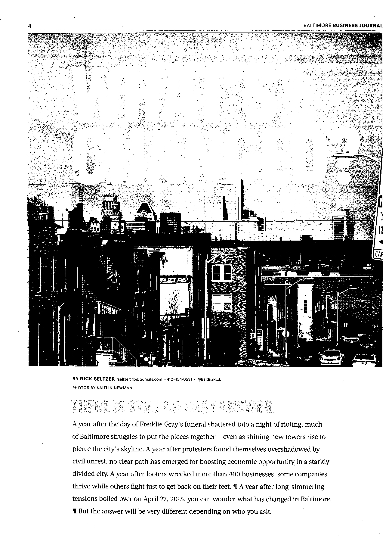
Different aspects of design

The main variables explored in this research fall under five main categories, white space, headline, dominant media, color and number of images.

White space

In Mien-Tsung Tsai’s article, “Perceived Visual Aesthetics of Text-Overlaid Images: Computational Models and Experimental Research for White-Space Fraction,” he defines white space as the empty space that exists around different elements of a page layout, which includes columns, lines of type, photos, graphics and more. White space is also sometimes referred to as negative space when the actual color of the space isn’t white, but has no text or subject matter within it. Tsai also states that white space helps to separate elements, which gives them greater prominence from the background (Tsai et. al).

And images and headlines will also garner greater attention if there is ample white space surrounding it (Bergstrom, 2008). Therefore, it follows that white space would be a common tool on award-winning pages because the designer would want to bring attention to the article or imagery that goes along with it.

Headlines

Headlines today are typically aligned left, are wider rather than narrower and sometimes include decks (Harrower, 2002). In order to make the hierarchy of a page clear, it is also important to make sure that the size of the headline is significant enough to make it stand out from the rest of the page (Bergstrom, 2008).

According to Bergstrom, the size of the headline also doesn’t need to be excessively large if it is surrounded by white space because the additional space would give it a greater impact.

Dominant Media

Using photography is common in newspapers, and as mentioned earlier, is often a way for readers to enter the page. But the kind of photo or dominant imagery also affects how quickly the audience looks at a page. According to Leckner, who divided pictures into four different subjects (information graphics, maps, drawings and photos), all of the picture elements except for information graphics were looked at earlier.

Photos will attract the reader regardless of the subject of the article it’s associated with, and if the photo is natural, it will be looked at longer than a staged photo. Photos with faces in them are also looked at earlier than photos with just objects (Leckner, 2012).

Staged photos and photo illustrations are defined in that study as, “photos that have been altered with gradients and blurs, images that have been created by compositing two or more images and images of people who have been removed from their backgrounds.” These have also become much more common in newspaper front pages, and they are used in 86.3 percent of newspapers (Leckner, 2012).

But infographics were the only pictorial element that did not get looked at earlier, which is attributed to readers seeing them as requiring more effort, so more easily accessible content is looked at sooner (Holmberg, 2004).

Illustrations are often used for abstract concepts. Drawings that are based more off the tone of the story instead of a direct representation of the people in the article are often common in features pages (Harrower, 2002).

Overall, dominant art is used on all current newspaper front pages. In 76.2 percent of newspapers, a single photo is used as the main art, while 10.2 percent used an illustration or photo illustration. 4.9 percent of newspapers used illustrations, 4.6 percent used a photo package and 0.8 percent used headline art and infographics (Morris II & Haught, 2018).

Color

According to Bergstrom, color in newspaper design is often seen as a way to grab the reader’s attention through the contrast against the black and white background of the paper. Now that most newspapers print certain pages in color, it’s important that color is used functionally, to attract, inform, structure, teach and create the correct atmosphere that fits with the content. However, studies have found that color doesn’t necessarily grab the reader’s attention first, but does help increase reading time for the accompanying article (Leckner, 2012).

Currently, 98.7 percent of newspapers use both colored text and color photographs on their front page, making it a very popular design choice (Morris II & Haught, 2018).

Number of images

According to the study, “America’s front pages: A 30-year update” by David L. Morris II and Matthew J. Haught, 46.2 percent of newspapers use two or three main photographs on their front page and 12.1 percent of newspapers only use one photo.

How visuals interact with words

Of course, there is more to excellent news design than just the individual components of each page. In James de Vries’ “Newspaper design as cultural change,” he explains that there are three main areas of newspaper design projects: a technical and typographic side, the editorial and component ideas, and systems thinking for clients to adjust their processes (de Vries, 2008).

He continues to discuss how designers need to focus not just on the aesthetics of pages, but how they relate to their audience and reflect their culture. Visuals should be seen as a necessary part of the newspaper and thought about at the conception of stories and the news cycle instead of at the end to give the design team more time to best reflect the content of the article (de Vries, 2008).

Media logic framework

While page designs vary significantly for different articles, topics, newspapers and sections, there are still commonalities that can be found among top tier designs. By expanding the current research about the common characteristics of newspaper designs and focusing instead on what makes a page an award-winning design, this research will provide insight into the details about the proportions and statistics of particular elements in these pages and the similarities and differences between different sections and nations.

This research is similar to other studies of award-winning design, such as Hans Beyers’ article, “What constitutes a good online news site? A comparative analysis of American and European awards,” which focuses on the presence of four main components in websites of a variety of news organizations (2006). The same frame used in Beyers’ study, the media logic of new media, is applied in this study. Media logic is defined as, “the particular institutionally structured features of a medium, the ensemble of technical and organisational attributes which impact on what gets represented in the medium and how it gets done” (Beyers, 2006). Therefore, the focus of this research is also on the technical attributes of design, and not on how they relate to the actual content of the articles.

While award-winning design is also critically based on the visuals’ relationship to the article and the best way to explain the story to the reader, this research will focus purely on the individual components that make up each page. But it is important to realize that following the exact proportions and numbers detailed in this paper won’t guarantee an award-winning design.

Methods

For this research, the award winners from the Society for News Design’s “The Best of News Design 38” were used. The “Best of News Design” competition is an annual event where newspapers around the world submit what they think are their best designs in a variety of categories. Winners, ranging from “World’s Best Designed,” to Best in Show, Judges Special Recognition, Gold, Silver and Awards of Excellence are determined by a variety of judging panels. There were separate teams consisting of five people on each panel, and there was one for news, features, long form, visuals, and worlds best. There were also two conflict judges that would step in in case of an event where a judge was examining a page from their own paper.

“The Best of News Design 38” contained the winners from the 2016 calendar year. Only winners from certain categories were used. Pages that won for single-day photography, multi-day photography, infographics, redesigns, combination print and digital, portfolio (individual and staff), illustrations and magazines were not counted.

Coding scheme

Pages were coded for a variety of topics, including:

Page details

  • The name of the paper
  • The newspaper’s location
  • The section the page was a part of

While the other two categories were easily taken directly from the page details in the book, the section the page was a part of was divided into four different sections: news, opinions, features, and sports. Pages that were in the news section counted as news, pages in the sports section counted as sports, pages in the opinions section counted as opinions and all other pages counted as features, including business, arts, travel, and lifestyle.

Obituaries were always counted as news.

Pixel-based

  • Total pixels on the page
  • Size of the dominant image
  • Size of the dominant headline
  • Amount of white space

These pages were coded by opening jpeg images of the pages in Photoshop and documenting the number of pixels on the page. Boxes were drawn around the largest image on the page and the larFor white space, the page was converted to grayscale and then bitmapped, so that all pixels below the 50 percent threshold became black, and anything above the threshold became white. Then, all the white pixels could be counted as the white space on the page.

However, there are limitations to how the white space was measured. Because bitmapping counted all pixels that were below 50 percent black as white, portions of photos that were lightly colored were counted as white. Also, text that was lightly colored was also counted as white space despite not being white.

Additional details

  • Number of images
  • Whether the page was in color or black and white
  • What kind of dominant imagery the page had

The number of images on each page was determined by counting separate photographs, illustrations and infographic sections.

When determining what kind of dominant imagery was on the page, there were four different categories it could fall into: photo, photo illustration, illustration and infographic. The definitions of the different categories are as follows:

  • Photo: Any snapshot of a real-life event with little to no editing
  • Photo illustration: Heavily edited or staged photographs that have additional elements beyond just a picture
  • Illustration: A hand-done or computer generated drawing
  • Infographic: Graphic giving an in-depth explanation of a certain topic, often through numbers

After coding the data, the results were tallied in an Excel spreadsheet, and calculations were done to determine:

  • Percent dominant image
  • Percent headline
  • Percent white space on each page

These percentages were then analyzed by country and by section to discover the geographic and sectional differences in the different categories.

Works Cited

Bergström, B. (2008). Essentials of visual communication. London: Laurence King Publishing.

Beyers, H. (2006). What constitutes a good online news site? A comparative analysis of American and European awards. Communications, 31(2), 215–240.

de Vries, J. (2008). Newspaper design as cultural change. Visual Communication, 7(1), 5–25.

Harrower, T. (2002). The newspaper designer's handbook (5th ed. ed.). Boston: McGraw-Hill.

Holmberg, N. (2004). Eye movement patterns and newspaper design factors : An experimental approach.

Holmqvist, K., & Wartenberg, C. (2005). The role of local design factors for newspaper reading behaviour: An eye tracking perspective. Lund Univ. Cogn. Stud., 127.

Leckner, S. (2012). Presentation factors affecting reading behaviour in readers of newspaper media: an eye-tracking perspective. Visual Communication, 11(2), 163–184.

Morris, D. L., & Haught, M. J. (2018). America’s front pages A 30-year update. Newspaper Research Journal, 0739532918761071.

Tsai, M.-T., Wang, K.-A., Liu, Y., & Hong, J.-S. (2014). Perceived Visual Aesthetics of Text-Overlaid Images: Computational Models and Experimental Research for White-Space Fraction. International Journal of Human–Computer Interaction, 30(1), 1–23.